UX Research · Interaction Design

CoFurnish: A community kiosk for move-in and move-out furniture

Apartment residents often have to buy, sell, or dispose of bulky items when moving with limited time, transportation, and communication channels. We designed a lobby kiosk and mobile-assisted flow to make furniture exchange feel safe, affordable, and low-stress.

Role
Lead Researcher, Supporting Designer
Team
1 Research Lead, 2 Design Leads, 1 Project Management Lead
Timeline
4 weeks
Skills
Figma, User Research, Usability Testing
Deliverables
Research reports, storyboards, personas, style guide, wireframes, hi-fi prototype, physical kiosk prototype

Overview

Residents often struggle with furniture during move-in/out

Move-in and move-out windows are compressed and chaotic. We saw furniture left in hallways, on curbs, and near bulletin boards with handwritten notes. We siezed the opportunity to design an in-building furniture exchange system that removes transport friction, increases trust, and streamlines the process.

Challenge

Residents struggled to buy or dispose of large items within limited time, transportation, and communication windows.

Design Goal

Make furniture exchange feel as easy as leaving a package: quick, local, and clear.

Outcome

A kiosk + phone flow with guest browsing, QR photo uploads, listing management, and interest tracking.

Process

Our research-first roadmap

Through in-depth market research, fieldwork, interviews, and three rounds of testing, we validated which features renters needed during move-in and move-out.

Phase 1

Desk research + competitive scan

Mapped renter pain points and existing kiosk patterns.

Phase 2

Observations + interviews

Validated furniture stress points in real apartment complexes.

Phase 3

Storyboards + personas

Focused on renters with limited transportation or support.

Phase 4

Lo-fi → mid-fi → hi-fi testing

Iterated toward guest browsing, QR uploads, and clearer availability.

Phase 5

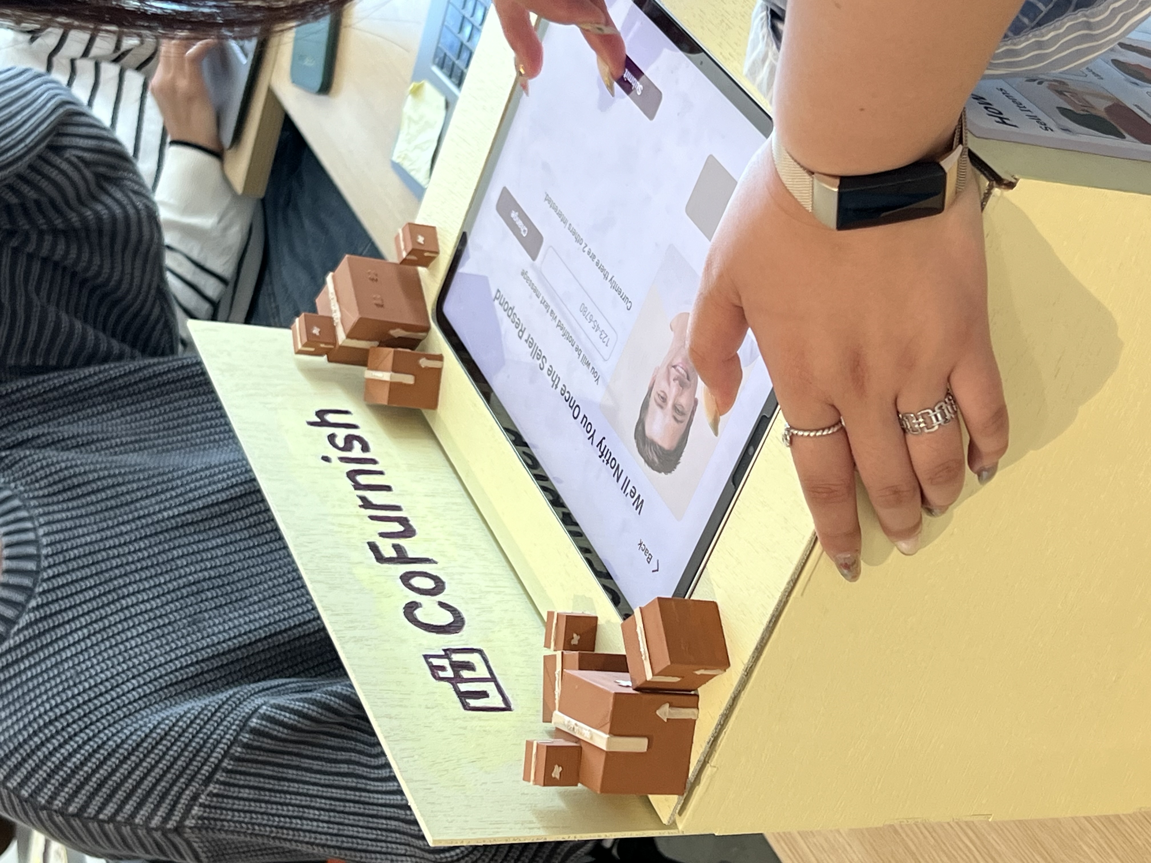
Physical kiosk build

Prototyped the kiosk body, signage, and final installation details.

Research

Desk research and field observations revealed furniture disposal pain existing kiosks ignore

We found that 15 out of 19 participants needed help moving large items, yet apartment kiosks focus on leasing and package pickup, and existing apps assumed car access and comfort with depending on complete strangers. Field observations confirmed that renters already resort to local peer-to-peer exchanges through bulletin boards and opportunistic hallway pickups.
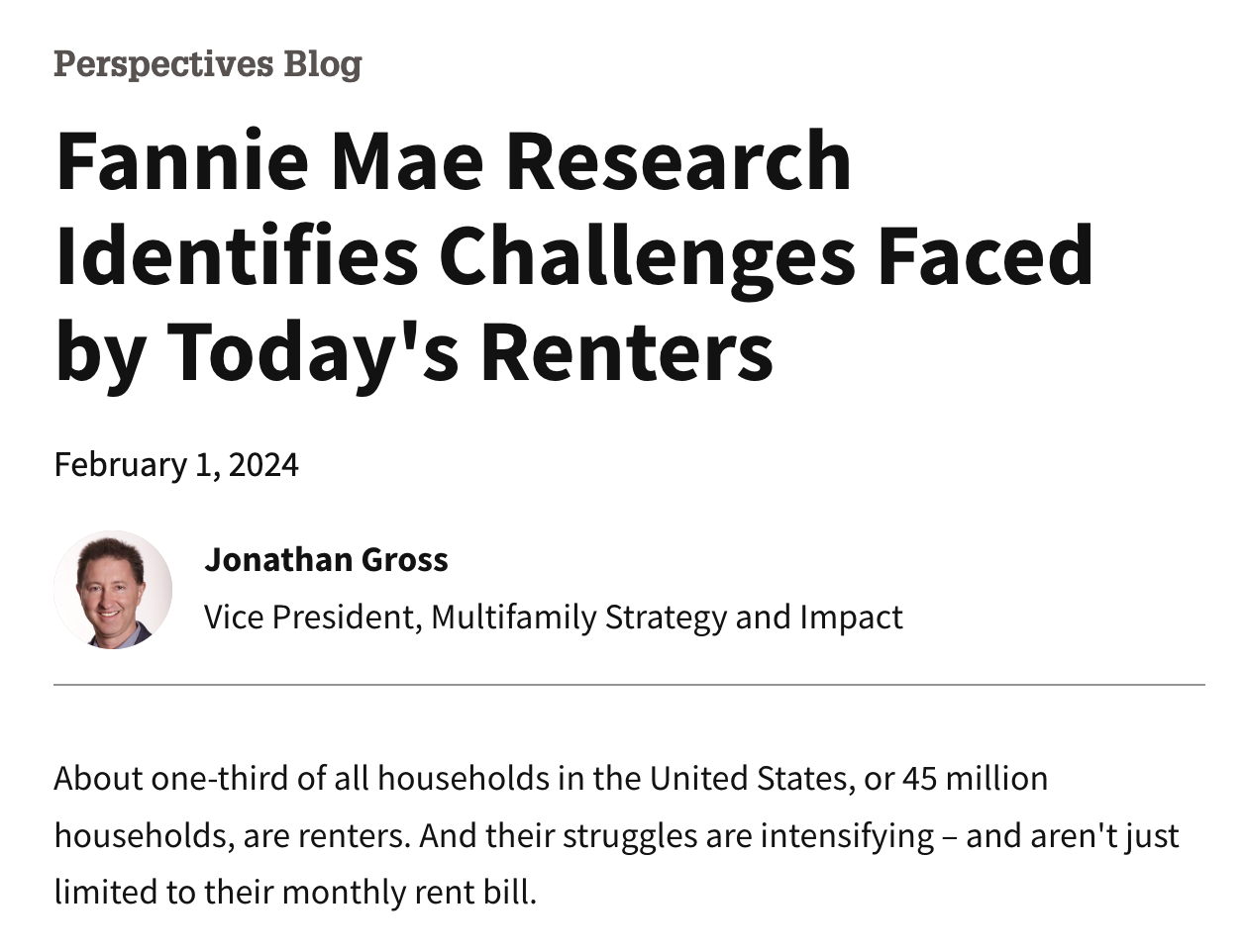
Clippings from desk research about renter challenges.
Desk research surfaced financial stress and hectic move-in processes.
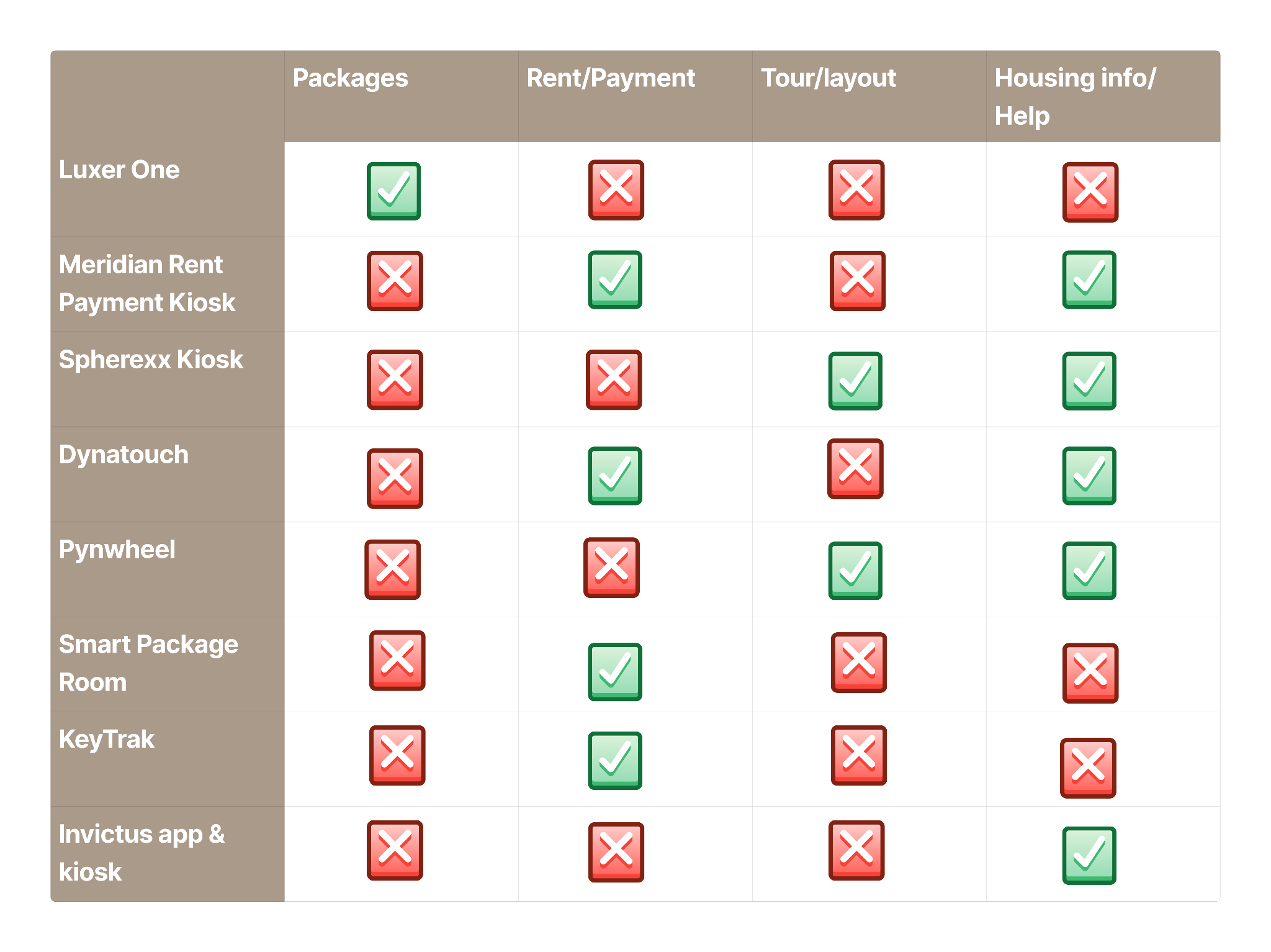
Competitive analysis table of existing apartment kiosks.
Competitive scan showed kiosks prioritize leasing and packages, not exchanges.
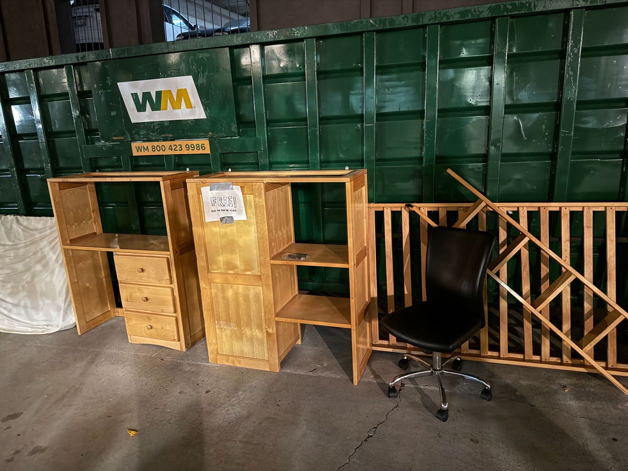
Furniture left outside during move-out.
Items left outside during move-out were common.
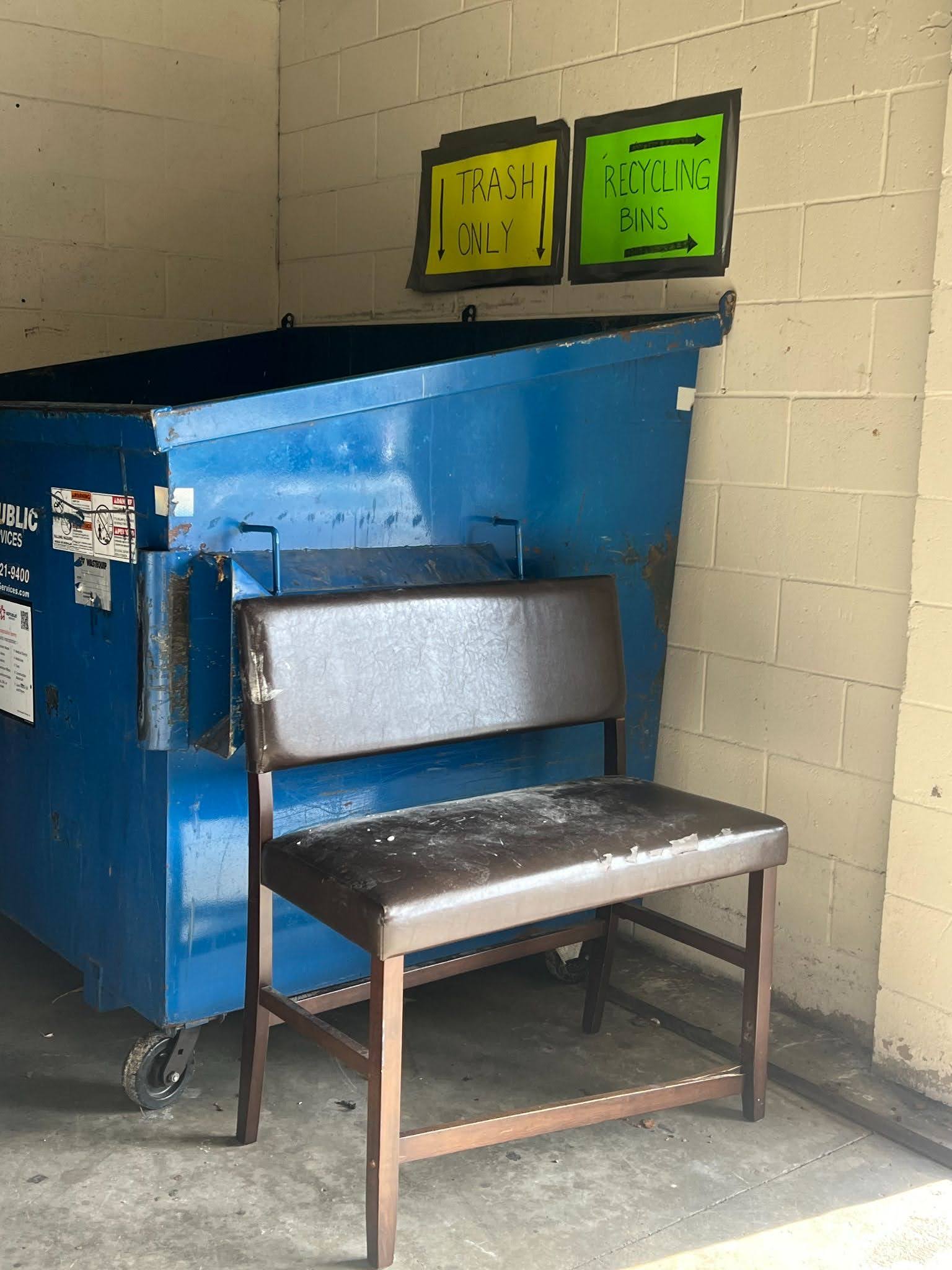
Furniture left near dumpsters during move-out.
More evidence of ad-hoc disposal during move-out weeks.
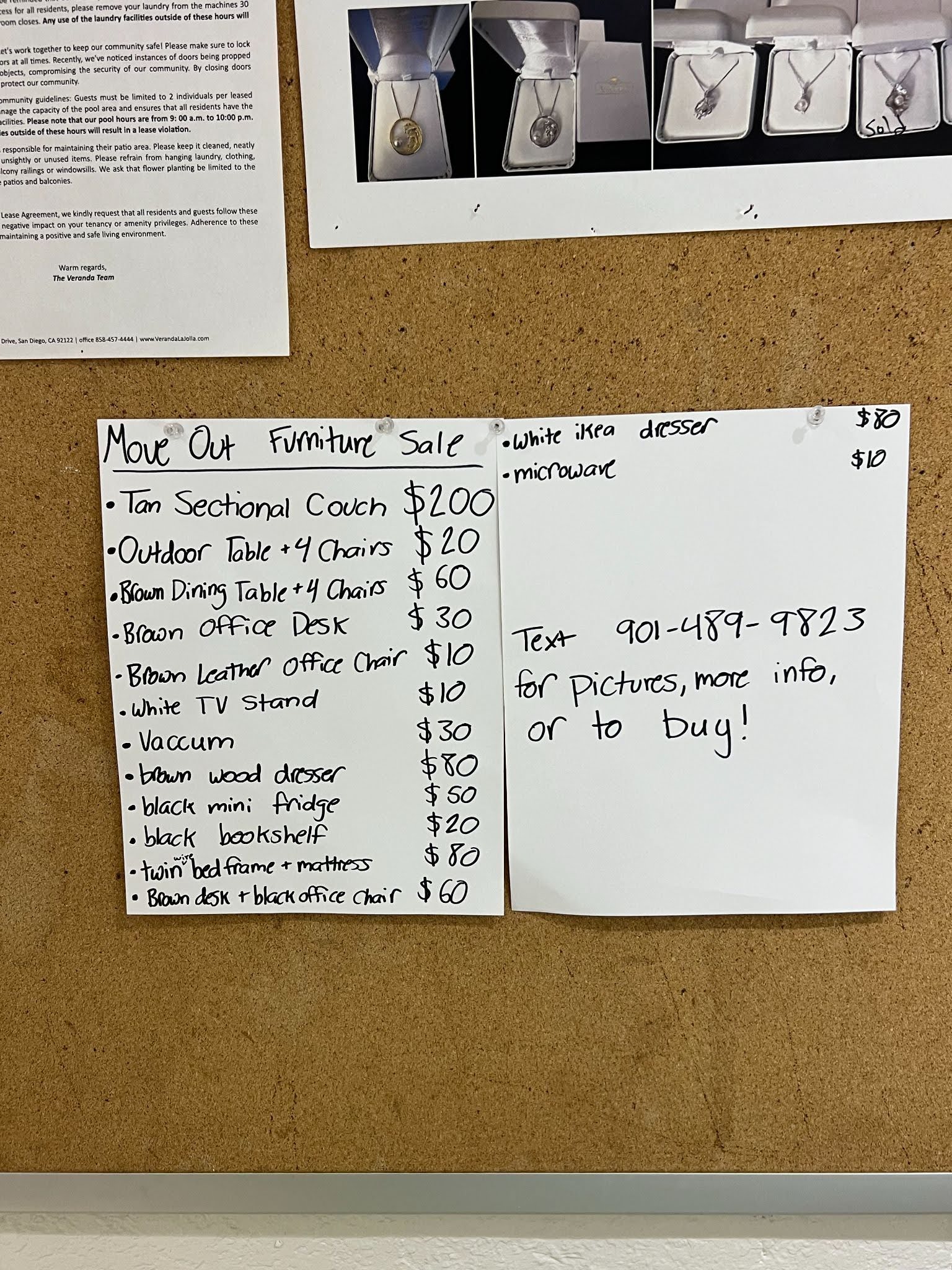
Bulletin board with handwritten furniture sale posts.
Handwritten posts signaled a need for better coordination.

15/19

participants needed help moving items

12/19

used cars, carts, or rentals to move furniture

10/15

relied on second-hand items (excluding participants with pre-furnished units)

Findings

  • Both move-in and move-out scenarios were stressful and needed support, particularly when transporting large items.
  • Existing in-complex systems already handle tours, packages, and payments, but not large item flows nor renter-to-renter coordination.
  • Residents trusted peer-to-peer exchanges inside the community, but relied on chance to coordinate.
  • Time pressure during move-outs led to abandoned furniture.

Initial Concepts & Low-Fi

Early sketches explored kiosk form, while paper flows validated buyer and seller tasks

We started with physical form explorations—testing a slanted kiosk design for stability and visibility. Once we simplified the structure, we moved into paper prototypes to validate core flows for both sides of the exchange: listing furniture and browsing available items.
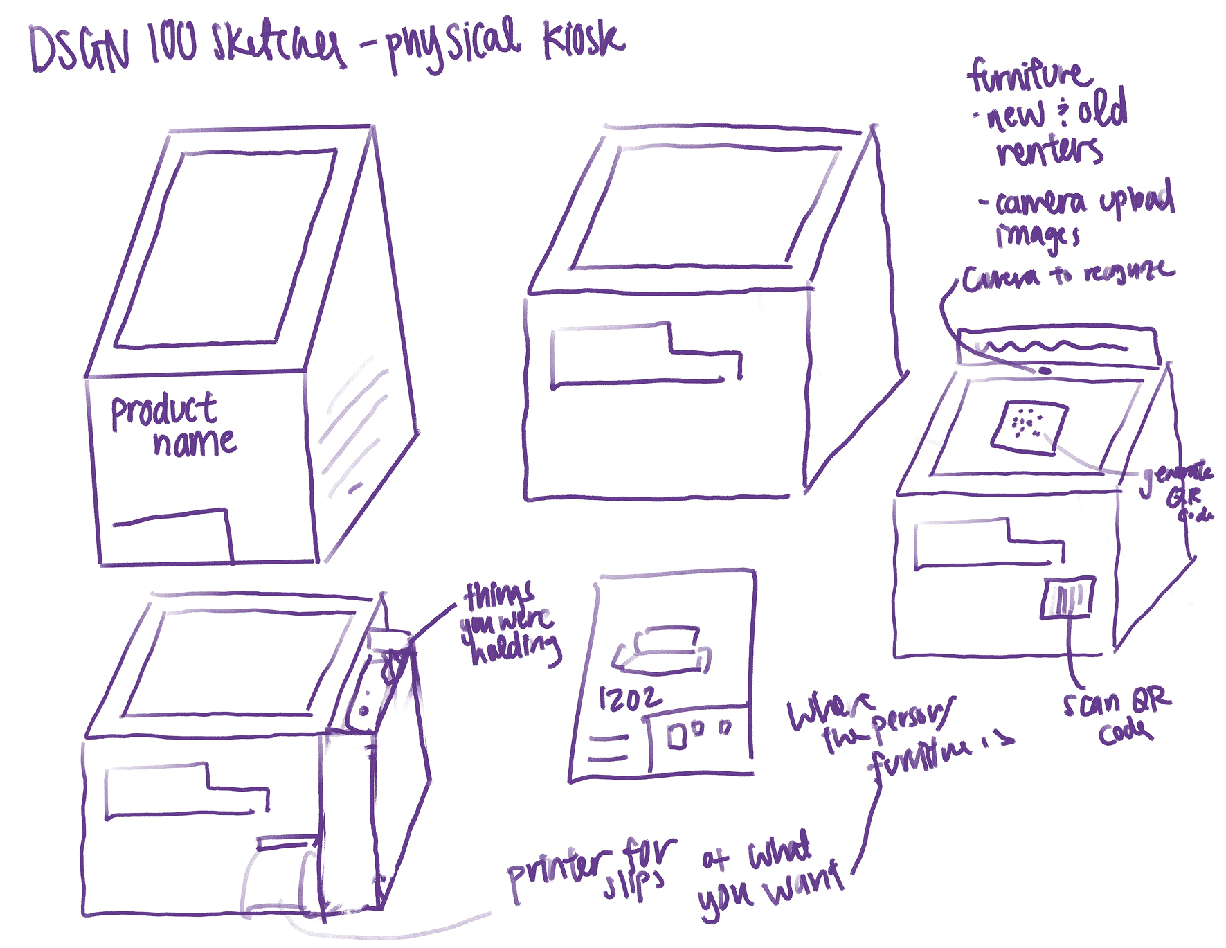
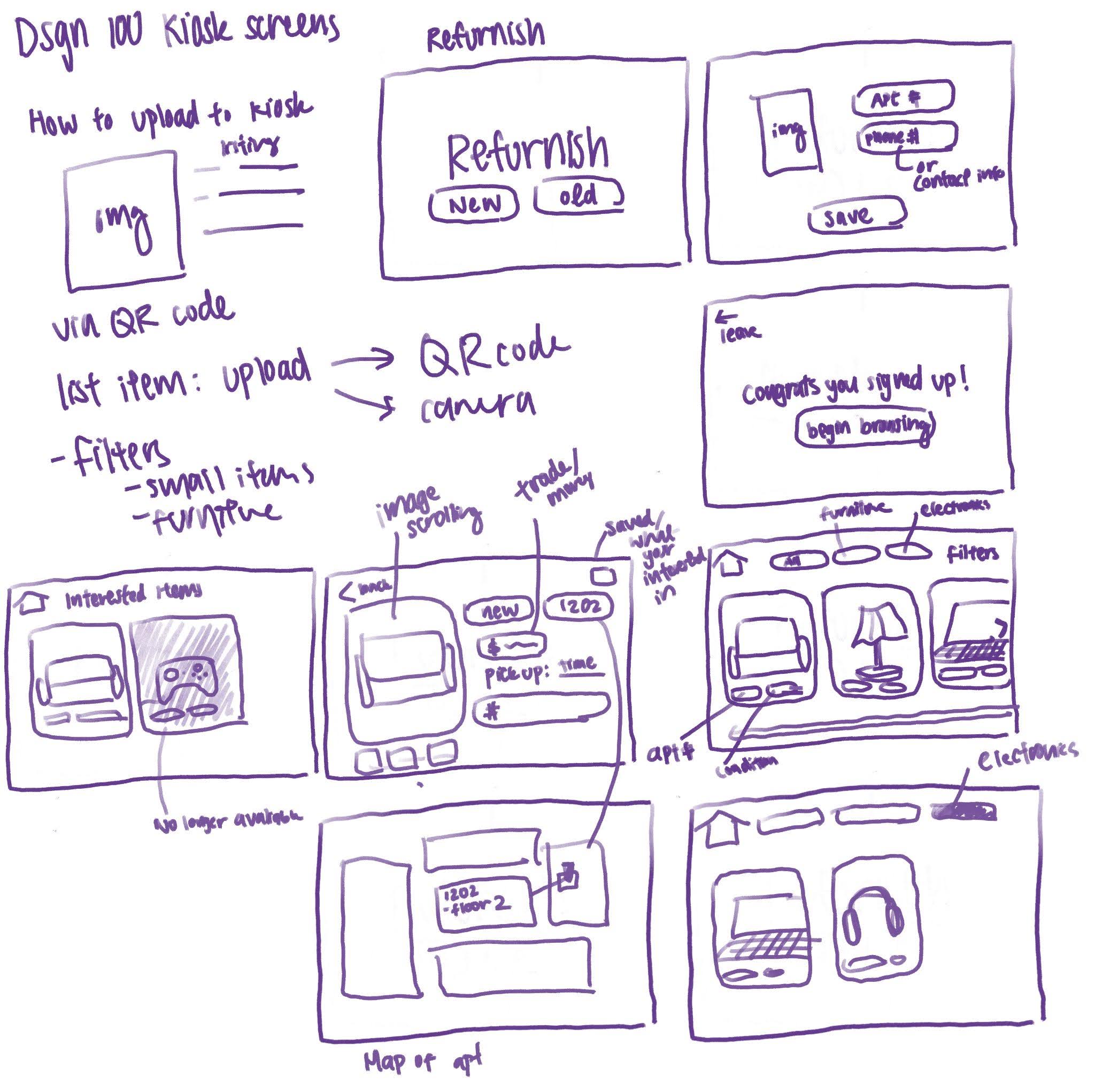
Early sketches of the kiosk form.
Initial kiosk form explorations.
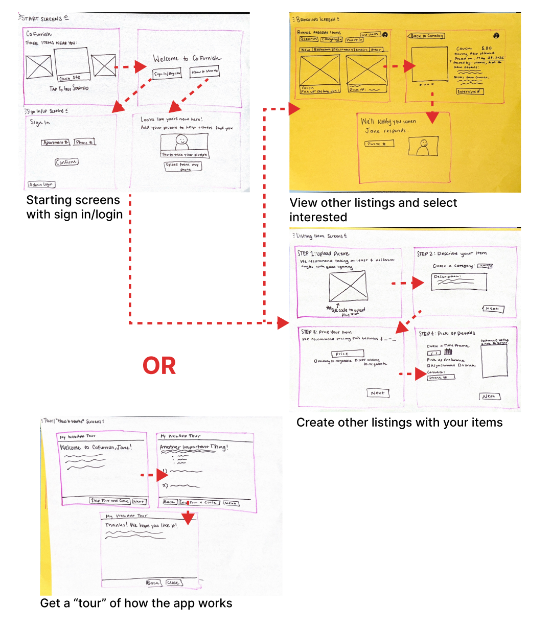
Sketches of kiosk interface screens.
UI sketch set for sign-in and browse flows.
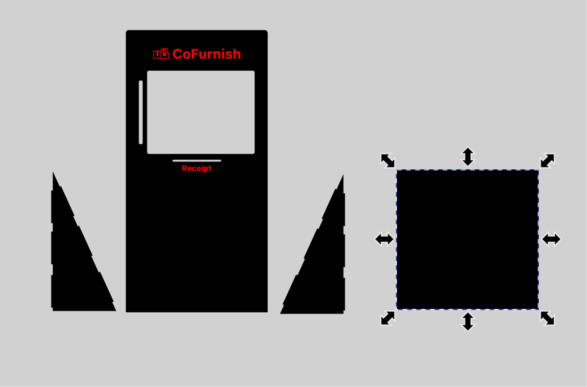
Inkscape prototype of the kiosk body and proportions.
Early Inkscape prototype to refine kiosk proportions.
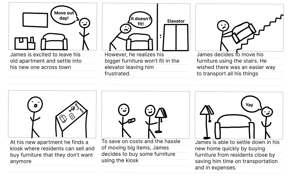
Storyboard illustrating move-in and move-out scenarios.
Storyboard validating both sides of the exchange.
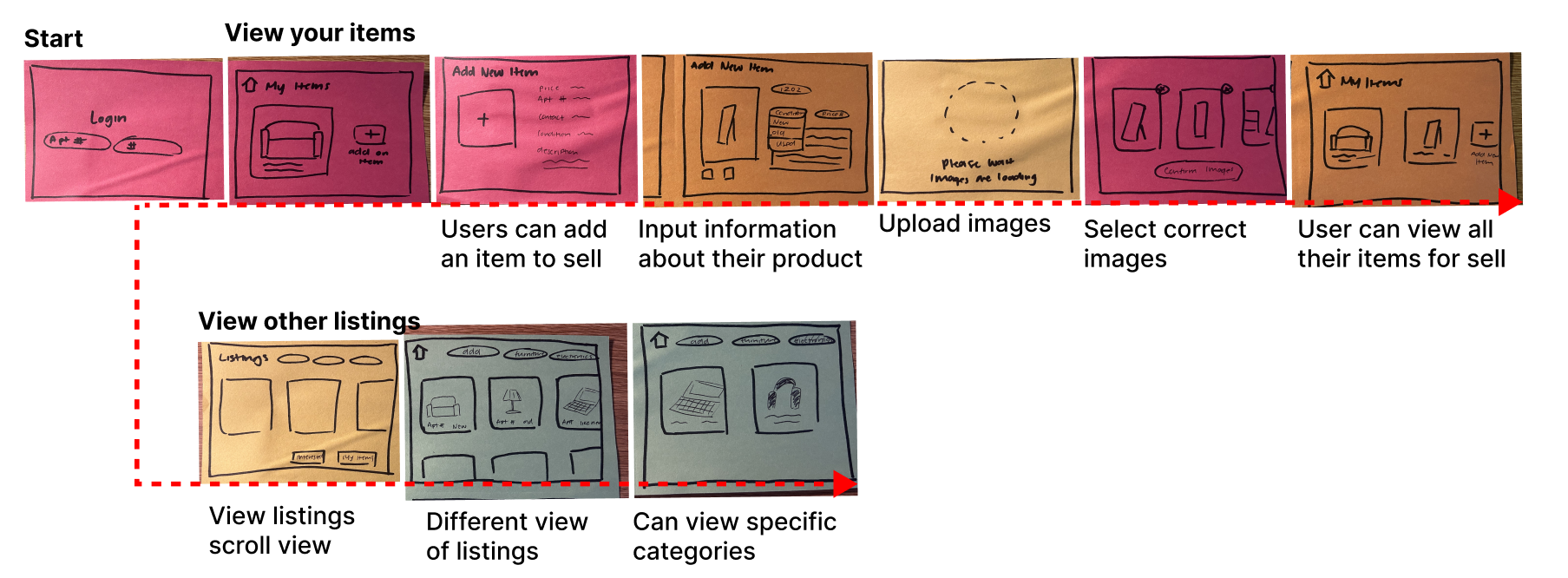
Paper prototype flow for listing an item.
Paper flow for listing and availability.
Paper prototype flow for browsing and saving.
Paper flow for browsing and saving items.

Wireframes & Mid-Fi

Usability tests surfaced confusion around availability and the need for saved items

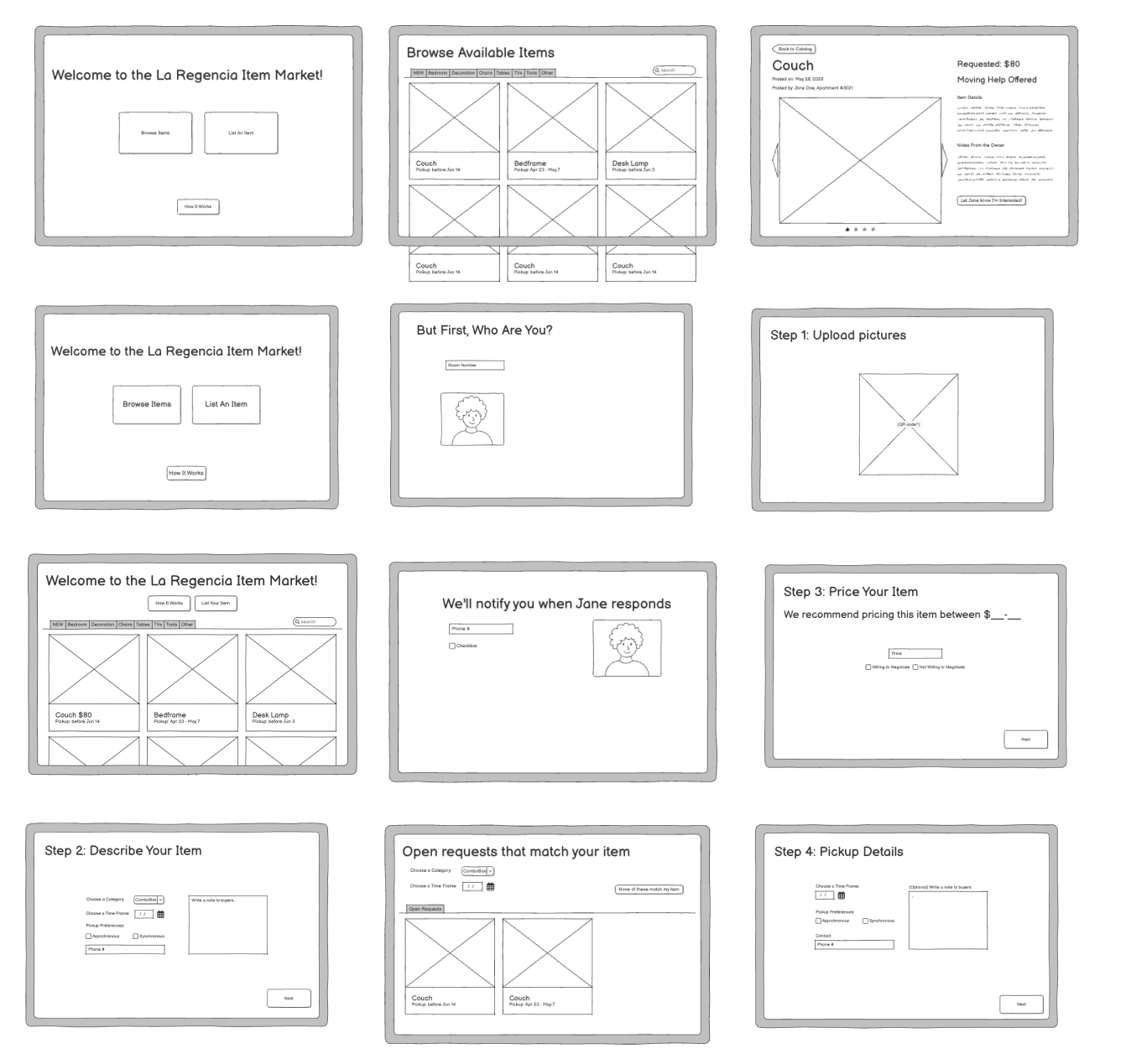
Participants struggled with availability entry (open text boxes) and had no way to return to items they were interested in. Mid-fi screens let us lock in navigation patterns and add a persistent "Interested Items" list.
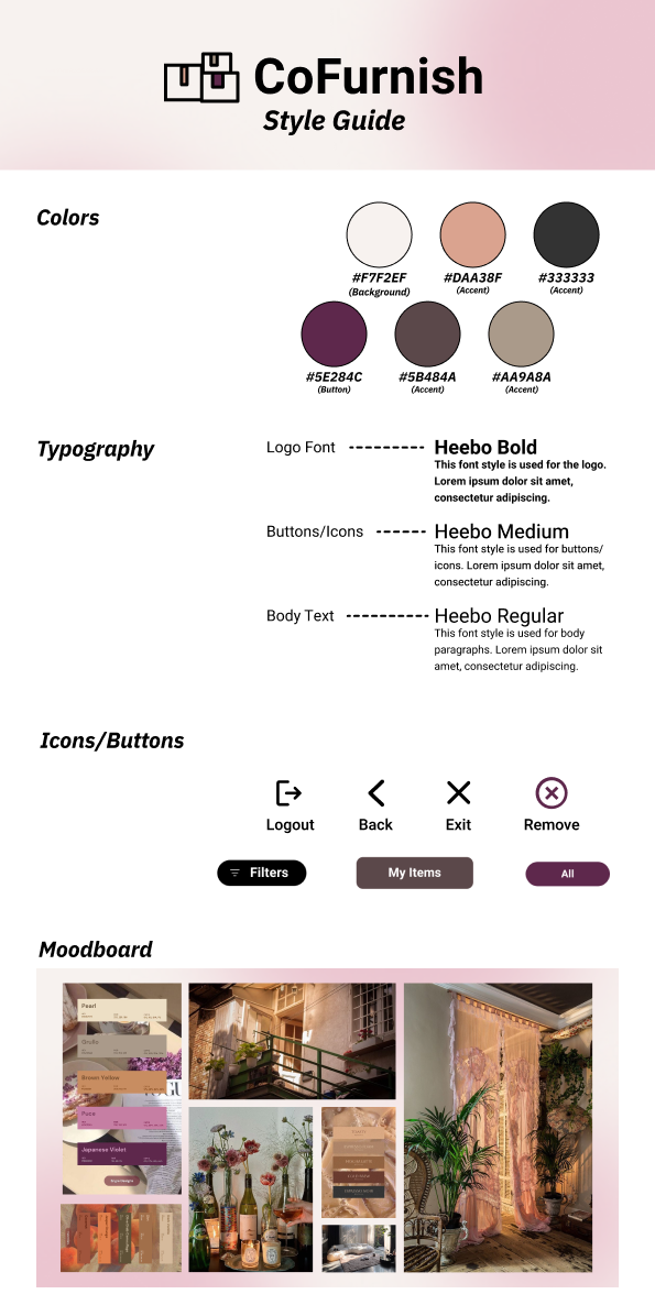
Style guide for the CoFurnish interface.
Style guide established type, color, and UI components.
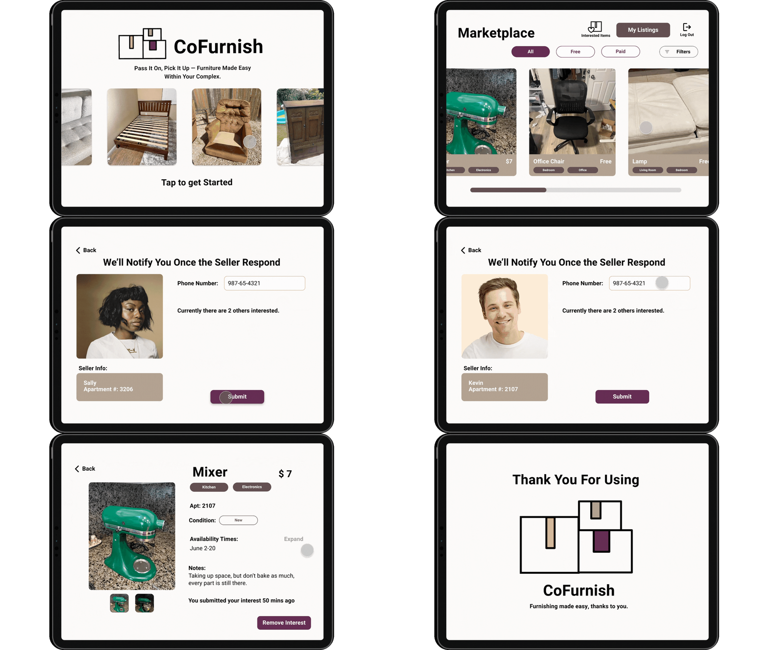
Digital wireframe showing browse and interest flow.
Digital wireframe refined browsing and interest paths.

Scenario 1: Move-out seller

  • Register or sign in.
  • Post a table for sale.
  • Set a pickup window for June 15.
  • Remove a prior listing.

Scenario 2: Move-in buyer

  • Enter as a guest.
  • Find a couch and express interest.
  • Review how pickup works.

Scenario 3: Returning user

  • Find the "Interested Items" list.
  • Check status updates.
  • Review seller details.

Availability clarity

We moved toward slot-based scheduling to avoid blank text boxes.

"The only challenge I had was with the white box again."

Interested items list

We introduced a saved list so users could return to items later.

"I like the 'My Listings' and 'My Interested Items' buttons."

Iteration & Hi-Fi

Wizard-of-Oz testing validated QR uploads, guest browsing, and interest notifications

Pairing the kiosk with mobile flows reduced typing friction and increased trust in the listing process. Wizard-of-Oz testing let us observe real user reactions to photo uploads via QR code and push notifications for interested buyers.
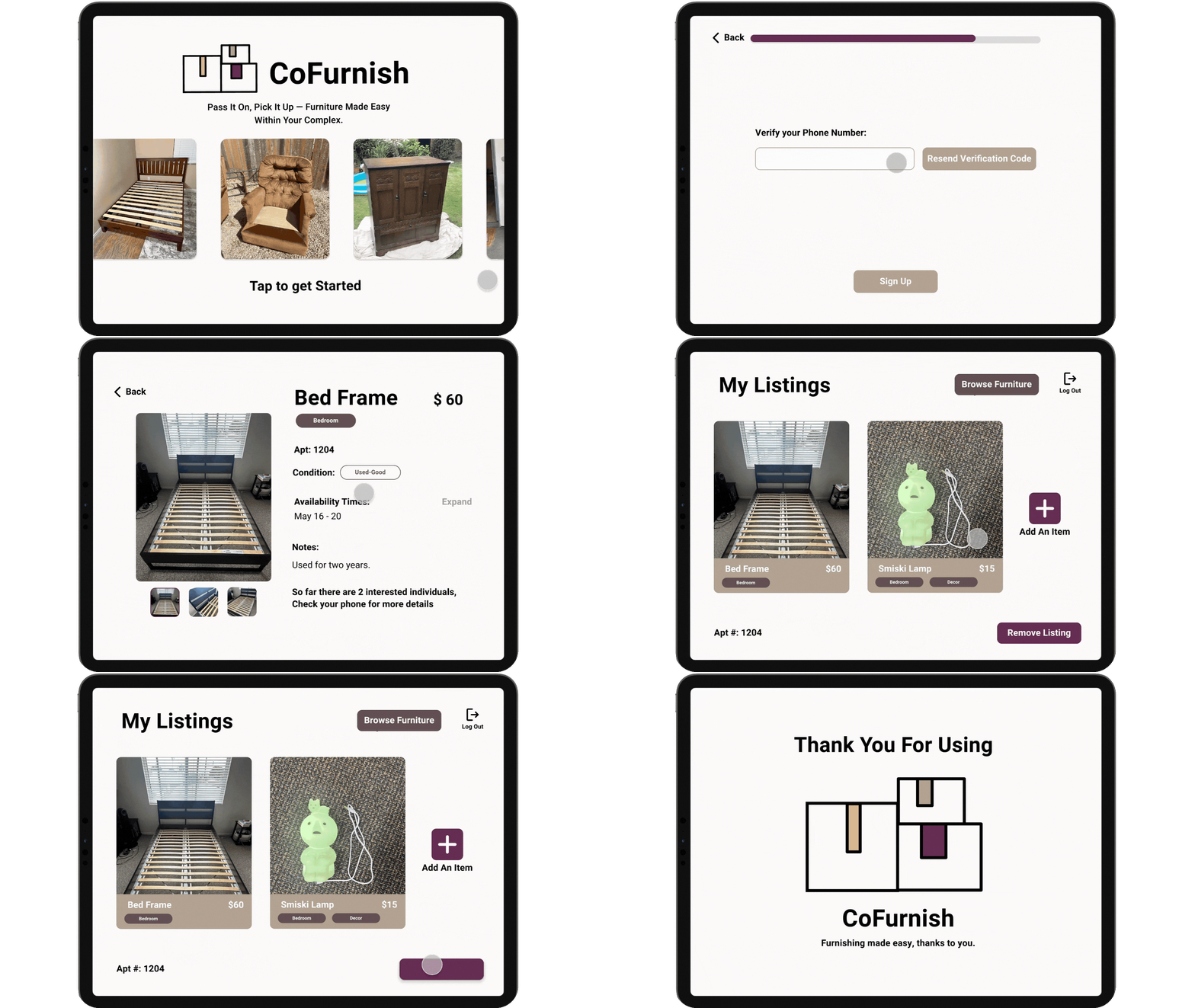
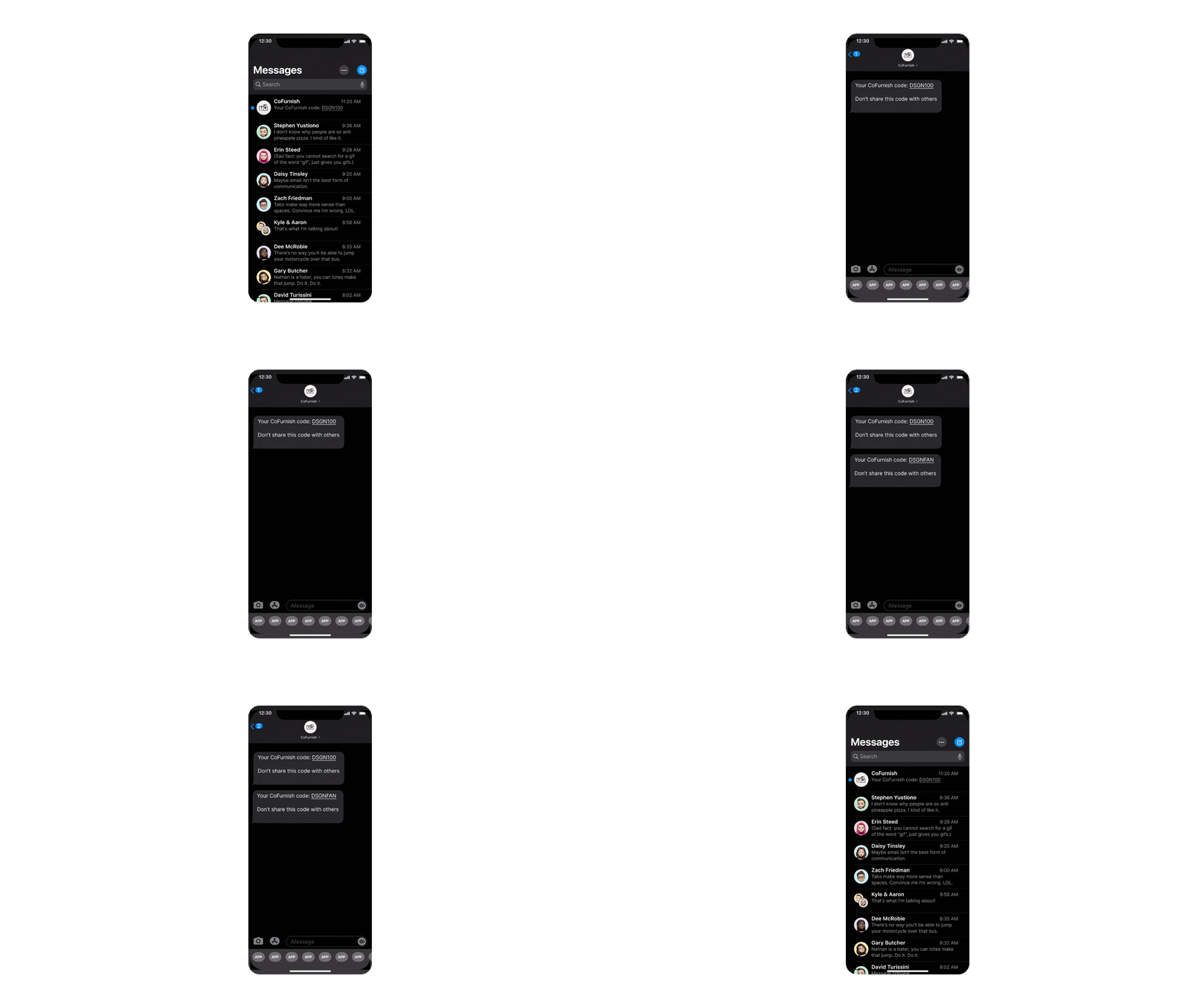
Registration flow gif for new users.
Registration flow for first-time users.
Wizard of Oz mobile registration flow gif.
Registration and verification during Wizard-of-Oz testing.
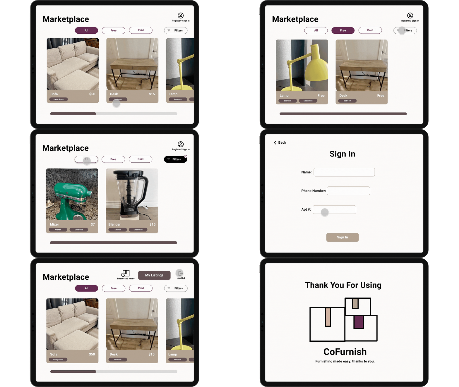
Sign-in flow gif for the kiosk.
Sign-in flow for returning users.
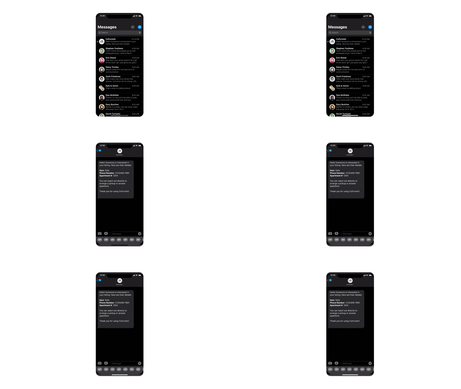
Wizard of Oz interested notification gif.
Interest notification flow for sellers.
Guest browsing flow gif showing listings.
Guest browsing flow before committing to sign-in.
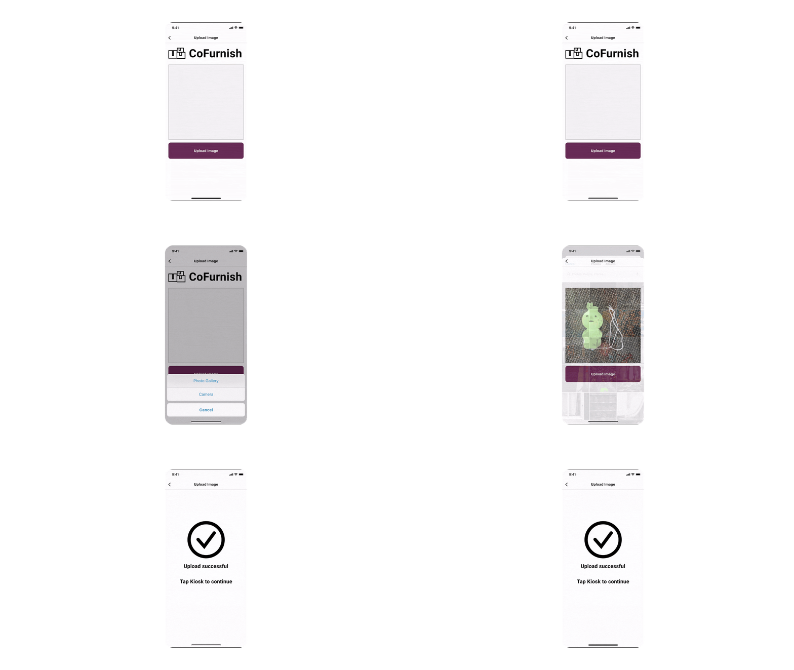
Mobile image upload flow gif.
QR-based photo upload reduced kiosk typing.

Guest browsing added

Users wanted low-commitment entry, so we added a guest flow.

"I like that I can browse without having to sign in first."

QR photo upload built in

QR uploads built trust and reduced kiosk typing friction.

"I like the QR feature, I thought it was a smart way to add pictures."

Final Experience

Guest browsing, QR photo uploads, and interest tracking create a low-friction exchange system

The final solution combines kiosk and mobile flows to handle both sides of the furniture exchange. Walk-up users can browse without signing in, sellers can upload photos via QR code, and both parties receive notifications when someone expresses interest.
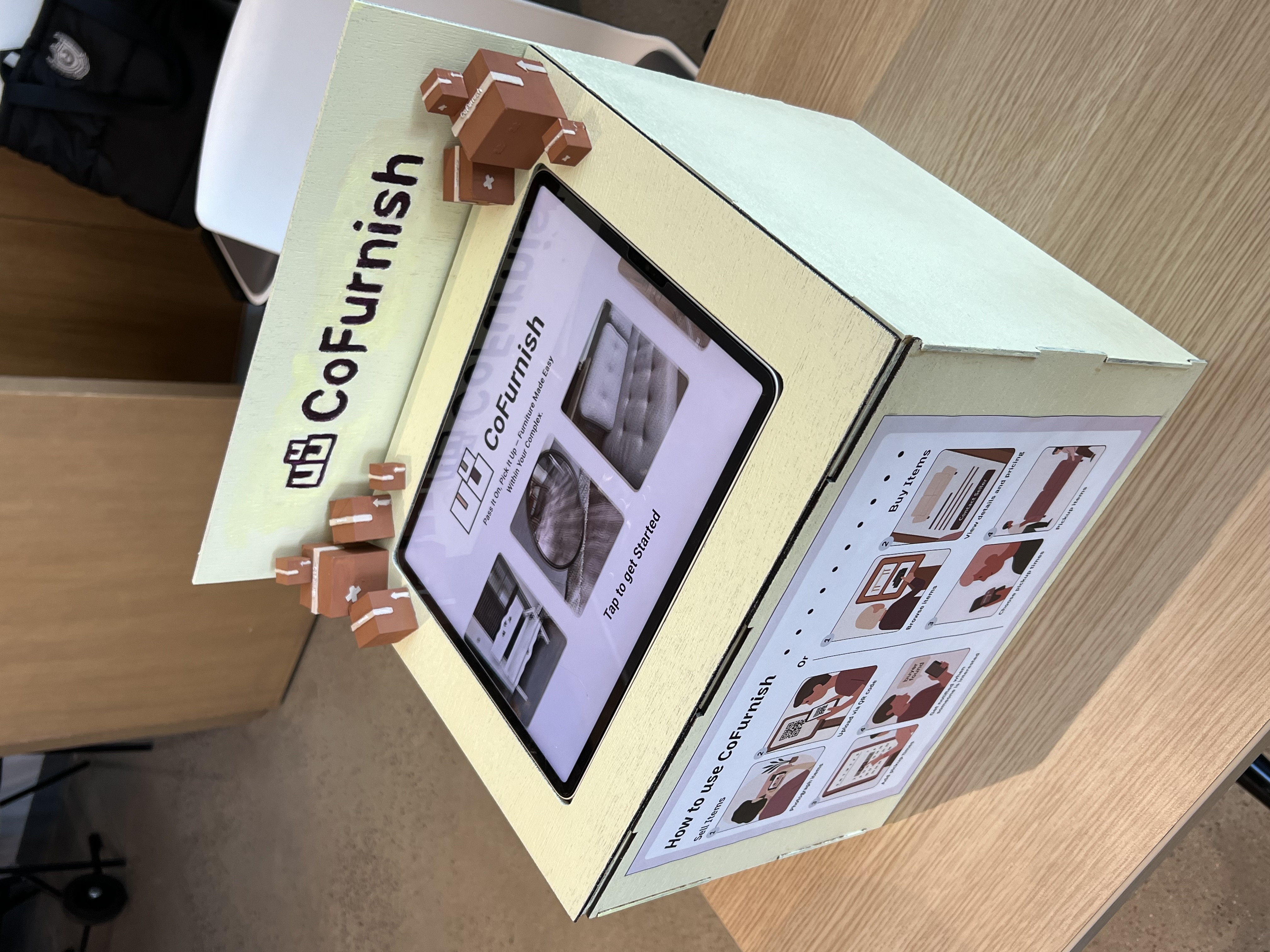
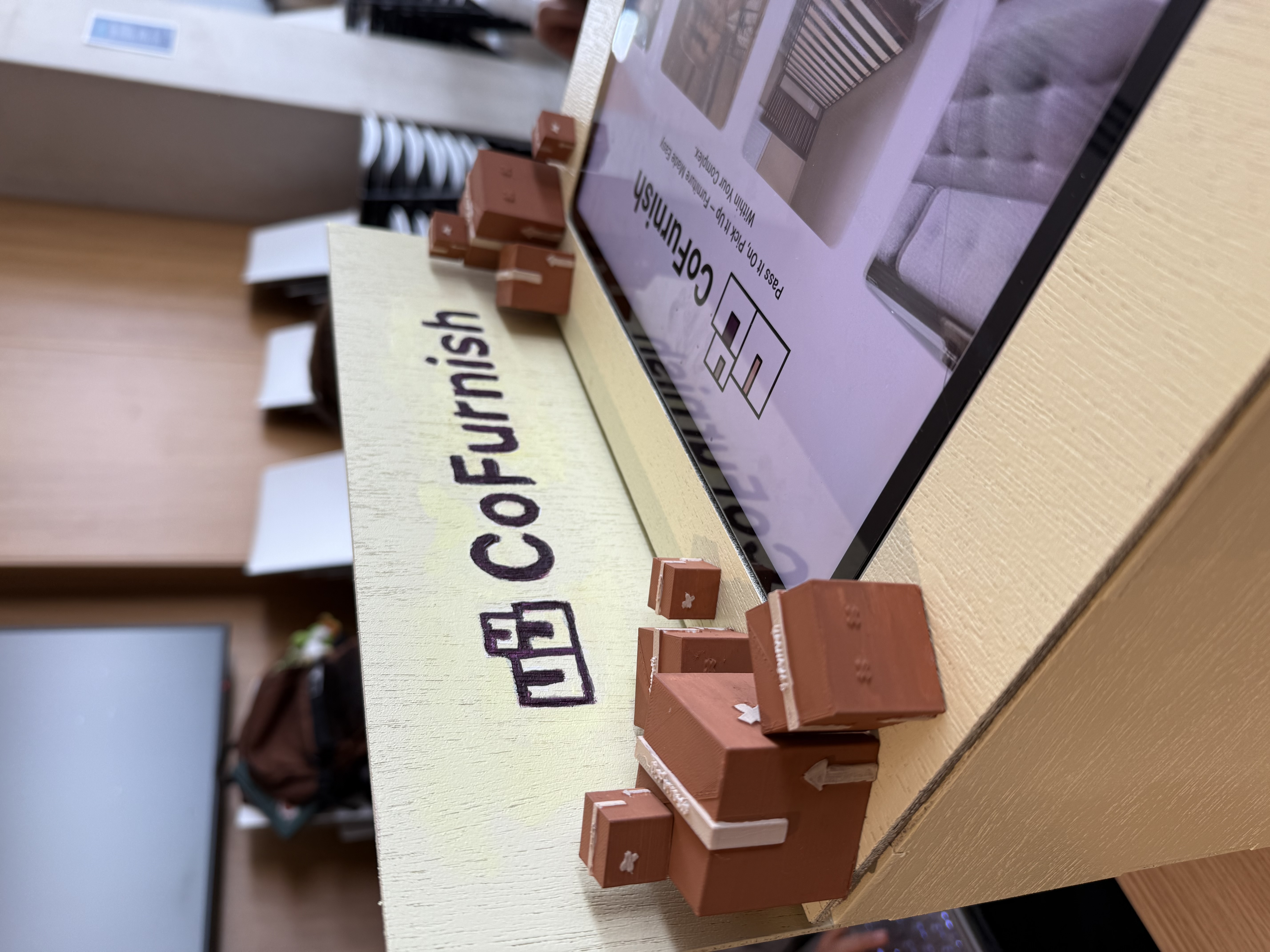
Full view of the final kiosk in its environment.
Final kiosk prototype with instructional poster.
Close-up of kiosk interface and branding.
Kiosk interface, branding, and tactile finishes.
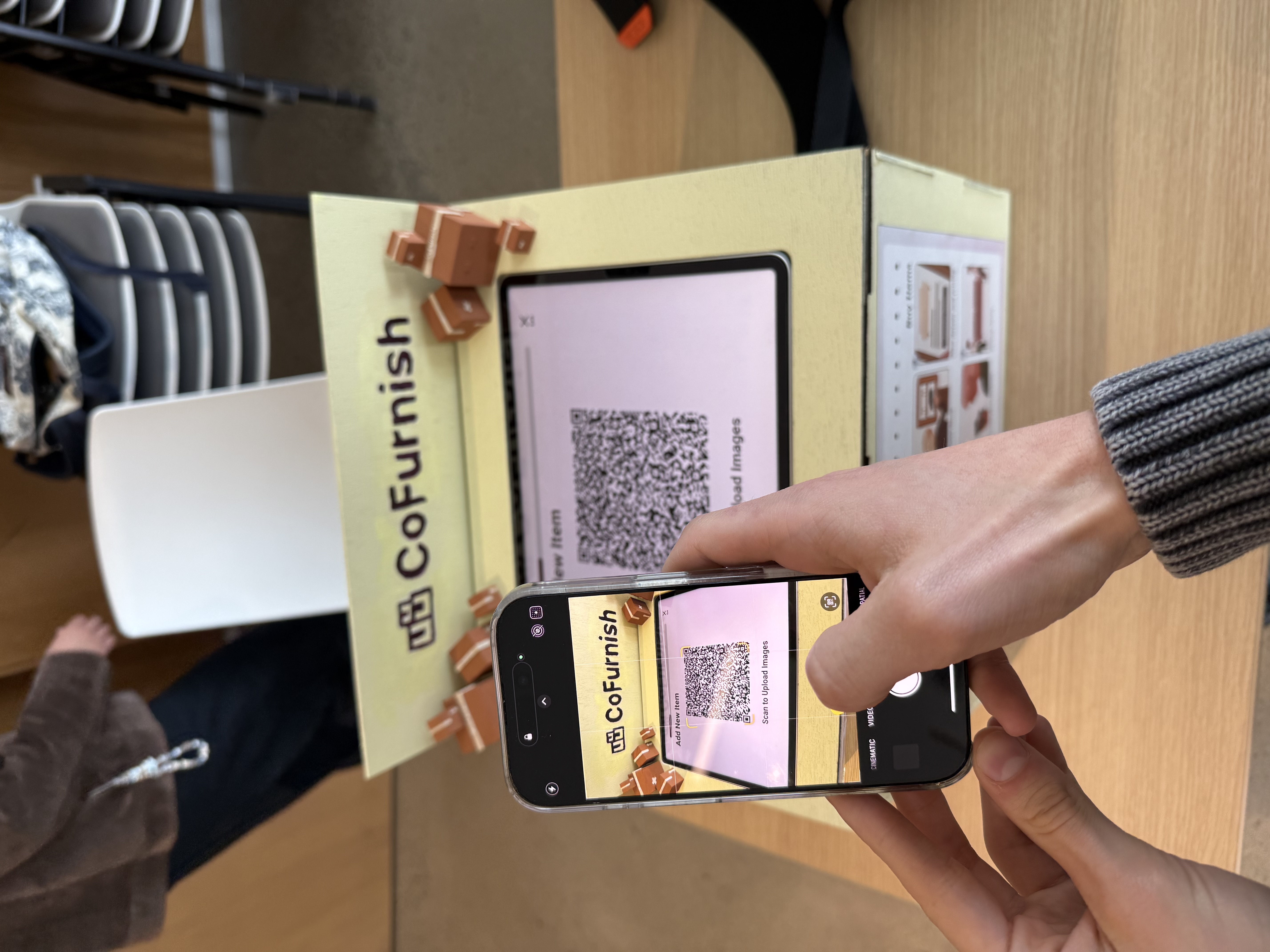
User scanning QR code on their phone.
QR code flow connecting kiosk to mobile upload.
Participant testing the kiosk during usability session.
Usability testing with apartment residents.

Interactive Prototype

Experience the full flow yourself

Full hi-fi flow. If the embed does not load, open the prototype in a new tab.

Results & Reflection

Participants rated core tasks 4-5/5, praised guest access and QR uploads

Hi-fi testing validated the clarity of instructions, low-commitment guest browsing, and trustworthiness of QR photo uploads. Remaining friction centered on availability entry (text boxes vs. time slots) and buyer-side rules when multiple people express interest.

What improved

  • Guest browsing lowered commitment.
  • QR upload made listings feel trustworthy.
  • Interested items list enabled quick returns.

What still needs work

  • Buyer-side rules for multiple interested users need clarity.
  • Availability should include time-slots as well as dates.
  • Slant kiosk screen & raise instructional poster to improve ergonomics.

Next steps

  • Prototype a scheduling picker with overlap indicators.
  • Add pricing guidance and response-time expectations.
  • Test with older renters and property managers.
"I like the QR feature, I thought it was a smart way to add pictures." Usability test (hi-fi)
"Everything seemed very easy to follow." Usability test (hi-fi)
"The interactions are great." Usability test (hi-fi)

Reflection

What we learned

Move-in and move-out moments are high-stress, logistics-heavy, and deeply social. When coordination is visible and commitment is low, residents feel more confident using shared systems.